Update: I’ve written a new article that makes it easier to plot two time series in the same graph.
Tableau is a great and easy to use data visualization tool, allowing you to create beautiful and meaningful visualizations within minutes.
From time to time I run into visualizations that are harder to implement in Tableau. Comparing two time series on a day level within the same line graph is one of them. Many webanalytics solutions like Google Analytics or ComScore Digital Analytix come with these kind of visualizations build in so replicating this in Tableau is a must for me.
I’ll share the steps I’ve taken to create a similar visualization in Tableau in this blogpost.

ComScore Digital Analytix current period vs reference period

Google Analytics Line Graph current period vs reference period
1. Working example
Please interact with the provided example below. It is hosted on Tableau Public, you can download the corresponding workbook for use in Tableau Public or Tableau Desktop by clicking the download link bottom right.
2. Parameters
First thing to do in Tableau is to create three parameters which let us select the current period start and enddate and the reference period. For this example I am using the Sample – Superstore – English (Extract) that comes prepackaged with Tableau. This extract is filled with data from 2010 up to 2013.
Parameter: Start date
I created a Startdate parameter with Data Type “Date” with a current value of december 1st, 2013 and the minimum and maximum values are set from field “Order date” restricting input to the available data.
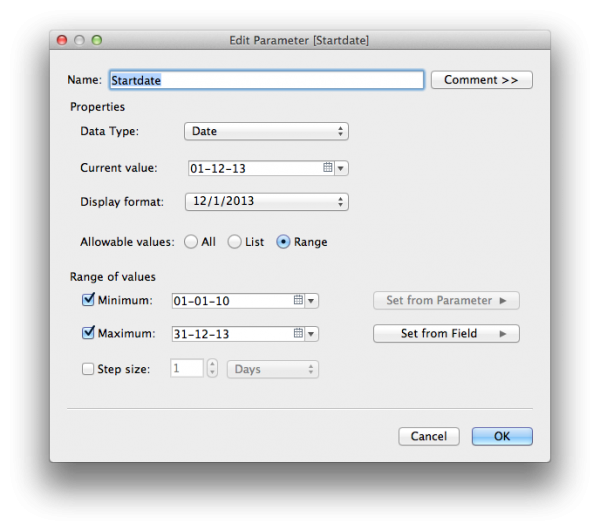
Tableau Desktop Startdate Parameter
Parameter: End date
I have made a similar parameter for selecting the Enddate, I used december 31st, 2013 as the current value and just like the Startdate the minimum and maximum are set by the Orderdate field. You can do this quickly by duplicating the Startdate parameter and adjusting the settings.

Tableau Desktop Enddate Parameter
Parameter: Reference period
The last parameter I am creating is used to select the reference period. This can be the directly preceding period or the same period last year. I used a Data Type “String” for this parameter and selected “List” for the allowable values. I then entered the two options in the list.
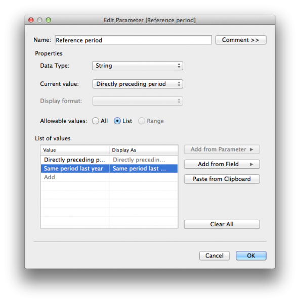
Tableau Desktop Reference Period Parameter
Parameter: Showing parameter controls
Right-click on the parameters and select “Show parameter control” to enable the parameter-controls on your sheet.
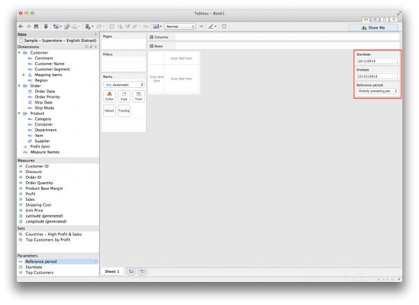
Tableau Desktop Parameter Controls
Calculated Fields
Next we create three calculated fields which will allow us to create a filter to only show the data from both the current and the reference period and label them accordingly.
3. Calculated field: Current period
The first will determine the current period and returns a string with the date range of the current period or “Hide”. We will name this calculated field “Current”
IF([Order Date]>=[Startdate] AND [Order Date]<=[Enddate])

THEN "Current: "+STR([Startdate])+" - "+STR([Enddate])

ELSE "Hide"

END
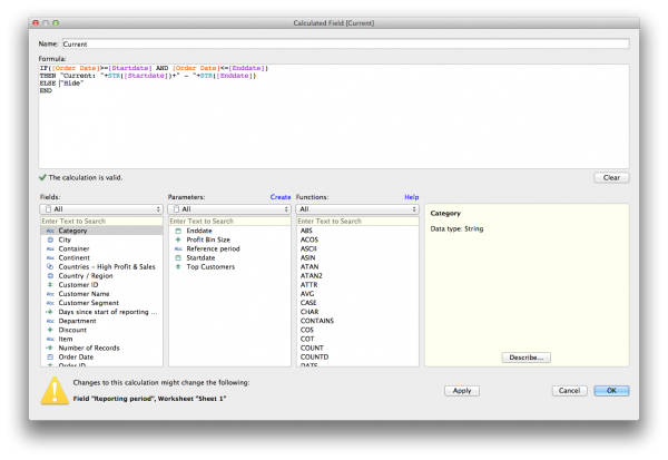
Tableau Desktop Calculated Field Current
Calculated field: Reference period
The second will determine the reference period and returns a string with the date range of the reference period or “Hide”. We will name this calculated field “Reference”.
IF([Reference period]="Directly preceding period")

THEN

IF([Order Date]>=(DATEADD('day',DATEDIFF('day',[Enddate],[Startdate]),[Startdate])) AND [Order Date]<[Startdate]) THEN "Reference: "+STR(DATE(DATEADD('day',DATEDIFF('day',[Enddate],[Startdate]),[Startdate])))+" - "+STR([Startdate]-1) ELSE "Hide" END ELSE IF([Order Date]>=(DATEADD('year',-1,[Startdate])) AND ([Order Date]<=(DATEADD('year',-1,[Enddate]))))

THEN "Reference: "+STR(DATE(DATEADD('year',-1,[Startdate])))+" - "+STR(DATE(DATEADD('year',-1,[Enddate])))

ELSE "Hide"

END

END
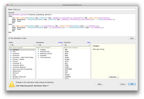
Tableau Desktop Calculated Field Reference
Calculated field: Reporting period
The third one will combine the first two calculated field so we can create a proper legenda. We will call this “Reporting period”
IF([Reference]!="Hide") THEN [Reference]

ELSEIF([Current]!="Hide") THEN [Current]

END
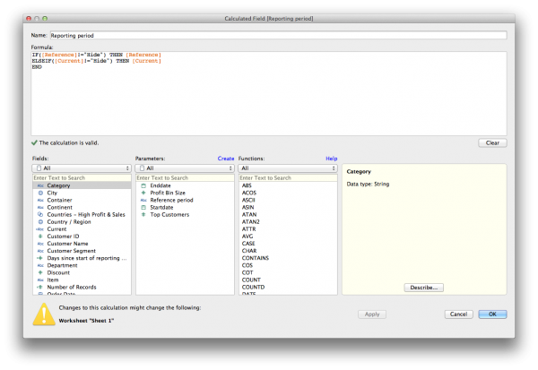
Tableau Desktop Calculated Field Reporting Period
4. Table Calculations
Table Calculation: Days since start of reporting period
Most examples show a line graph plotted with date along the x-axis, but actually you’re looking at the days since start for each line. So this is what we have to calculate to plot our x-axis. We will do this by creating a table calculation which is computed using the Order Date field. We’ll call this calculation “Days since start of reporting period”
DATEDIFF('day',WINDOW_MIN(MIN([Order Date])),MIN([Order Date]))
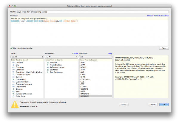
Tableau Desktop Table Calculation Days Since Start
5. Sheet setup
Step 1. Drag the calculated field “Reporting period” from the Dimensions shelf to the Filter card and set the filter to exclude “Null” values.
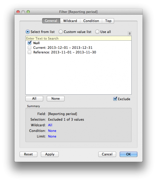
Drag “Reporting period” to Filter shelf
Step 2. Drag the “Sales” measure to the Rows shelf.
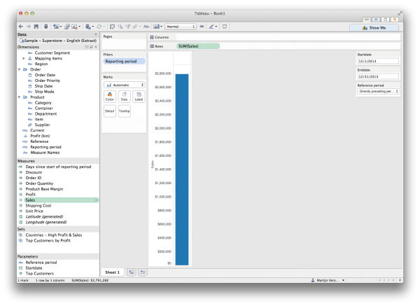
Drag “Sales” to rows shelf
Step 3. Drag “Order Date” from the Dimensions shelf to “Detail” in the Marks card and set this to the Continues Day level.
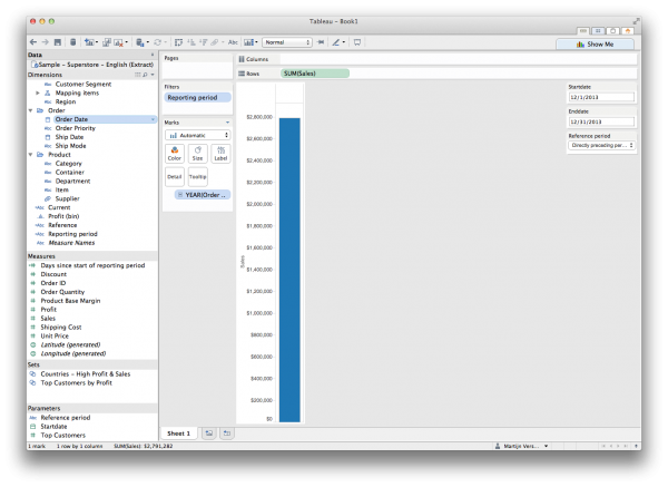
Drag “Order Date” to Detail in Marks card

Select date level Day Continuous
Step 4. Drag the “Days since start of reporting period” table calculation from the Measures shelf to the Columns shelf, right-click and adjust “Compute using” to “Order date”.
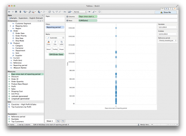
Drag “Days since start reporting period” to columns shelf

Adjust Compute using”

Adjust Compute using to “Order Date”
Step 5. Drag “Reporting period” from the Dimensions shelf to Color in the Marks card.
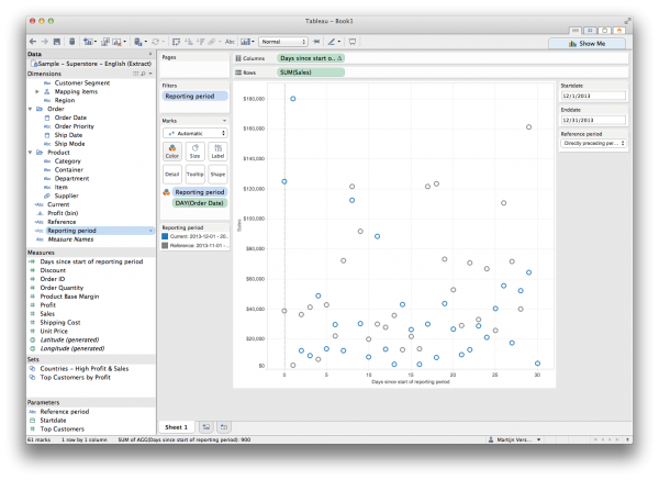
Drag “Reporting period to Color on the Marks card”
Step 6. Change the graph type in the Marks card to Line.
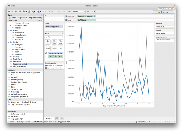
Change the graph type to line graph
Step 7. Do some formatting to make the graph look the way you want it.
Step 8. Enjoy the results!
NOTE: I’ve found a different technique for creating a similar result which is much easier to implement. You can find it in the blogpost Different time series on the same axis made easier
NOTE2: Readers have notified me that I made an error in one of the calculations. The calculation for reference period is incorrect. You can find the corrected calculation below.
IF

([Reference period]="Directly preceding period")

THEN

IF

([Order Date]>=(DATEADD('day',DATEDIFF('day',[Enddate],[Startdate])+1,[Startdate])) AND [Order Date]<[Startdate])

THEN

"Reference: "+STR(DATE(DATEADD('day',DATEDIFF('day',[Enddate],[Startdate]),[Startdate])))+" - "+STR([Startdate]-1)

ELSE

"Hide"

END

ELSE

IF

([Order Date]>=(DATEADD('year',-1,[Startdate])) AND ([Order Date]<=(DATEADD('year',-1,[Enddate]))))

THEN

"Reference: "+STR(DATE(DATEADD('year',-1,[Startdate])))+" - "+STR(DATE(DATEADD('year',-1,[Enddate])))

ELSE

"Hide"

END

END
What’s your opinion?
This visualization can obviously be improved by making adjustments to the formatting and labeling. I would love to hear how you would change this visualization! Is this setup useful for you, do you have any recommendations?

Thanks for this Martijn, great tips, works really well and the steps how to do it are perfectly clear.
Keep it coming 🙂
Cheers,
Jakub
very cool! thanks for sharing.
Chad
Are you sure that Piwik offers charts to compare data from two different periods? I was looking for this feature and can’t find it. Can you give me a hint please?
At the moment this is a feature request with a mid term milestone attached to it. As far as I can tell at the moment there is no one working on this at the moment. There do seem to be some plugins offering this functionality on Github but I haven’t tested them. I’ll adjust my post.
Thanks for this article. One question: When I try to create the table calculation in step 4 for my data source (Excel file), I don’t receive the option to do so. Is this a data source issue, or a symptom of something else. I can select that option on your sample worksheet, so it’s not a version issue.
Nevermind….it was a version issue (or maybe a combination of version and source). This works on 8.1, but not 8.2, at least for Excel.
Hi, that is brilliant. Is there any way to get bars rather than trendlines?
Like that: http://prntscr.com/6psqrl
Thank you
Hi Santiago,
I am not sure if I understand your question correctly. Please feel free to correct me if I misunderstood.
Do you want to recreate the graph you linked to in Tableau? If so, you can do this by putting SUM(Sales) on the Rows shelf and then WEEK(Order Date) on the Columns shelf. Next put YEAR(Order Date) to the right of WEEK(Order Date) on the Columns shelf and select Bar from the Marks card. Finally drag YEAR(Order Date) to Color in the Marks card. This should create the viz you linked to.
Thanks Martijn, I maganed to create a comparison bar chart using your logic…. but how do you think I could have the reference period also with date selectors?
Comparing 2 custom data ranges rather than ‘directly preceding period’ or ‘same period last year’
Thanks a lot, your blog is amazing
Hi Santiago,
You can change this by creating two date parameters for reference start and end date and by adjusting the calculated field “Reference period” to have the same structure as the calculated field “Current period” and replacing the used parameters. I hope this works for you, let me know if it doesn’t.
Martijn
Hi Martin,
Fantastic tutorial. Despite its complexity, it worked first time for me. One question: If I have a dataset where, for some days, there are no entries (I’m plotting counts), tableau does not plot the point – even though it should be 0. This means that if you have only two events that are at the start and the end of the period, Plateau gives you a horizontal line joining the two events, making it appear as though you had an event on every single day. How do you get Tableau to show that the events did not occur on the intervening days?
Thanks.
Hi Mark,
There are several ways to include Nulls in your visualization and Tableau has written a great post about it titled Handling Null Values.
In your case you want to convert a null to a zero, the formula for this is in the Tableau article. However, if you don’t have a record for a specific day it will still show as null instead of zero as Tableau hasn’t got a record to calculate against for that day. Instead you could create a CSV containing all dates and blend (or join depending on your data structure and connection type) with your dataset. Tableau now does have a record for each date and is able to convert nulls to zeros.
Is there a way to show the months on the bottom rather than Days since start of reporting period? I’m trying to compare number of events requested from Jan-Sept between 2014 and 2015
Yes, this is actually a lot easier as you don’t have to calculate days since the start of the reporting period.
You can drag the Date dimension to the Columns shelf and select a discrete month. Drag your metric to the Rows shelf this should give you a line graph where you see data for all months aggregated. Now drag your Date dimension from the Dimensions pane to Color on the Marks card and select Year. This should split your graph into multiple colored lines, one line for each year.
If you just wish to include Jan-Sept in your view drag your Date dimension from the Dimensions pane to the filter card and select Months (not Month / Year) and then select Jan through Sep.
I tried to have dates on the x axis following your instructions here. However, it turns into a scatter plot even though I selected line chart on the marks card.
Is there a way to show the date and still have it show up as lines?
Thanks!
Hi Elayne, unfortunately not. Our line chart is not showing dates but it’s showing the number of days since the start of each of the selected time series. By plotting the dates on the axis the two lines would be not been able to overlap.
Hi Martijn,
Great tutorial! I’ve been searching for an walkthrough like this and finally arrived at the right place. Quick question: do you happen to know a workaround that would allow for overlapping time periods? I’ve thought about duplicating the data source, but that hasn’t led me to a solution just yet.
Hi Jack,
Thanks for your response. Could you explain your use case for overlapping time periods? Do you want one line for January to June and another from April to September? You could adjust the calculations for the reporting and/or reference period to make this happen. The table calculation will calculate the days since start for each defined period so should work no matter if the periods overlap.
Hi Martijn,
Appreciate the quick response. Yes, I’m looking for the ability to show, say, January 1, 2014-June 1, 2014 and April 1, 2014-September 1, 2014 as two separate overlapping lines on the graph. I would like the user to be able to adjust the start and end dates for both the “current” and “reference” periods. The # of days included in one period doesn’t necessarily have to match the number in the second.
I’ve made some slight modifications already. I added two additional parameters — “Reference Start Date” and “Reference End Date” — that allow the user to select the start and end for the reference period. I changed the reference period calc so that it’s exactly the same as the current period one, except that it adjusts based on the reference parameters.
That gets me very close to visualization I’m looking for. The problem is that, based on how the reporting period calc works, each item can be in either the current period or reference period, not both. So, for your example, the data from April 1-May 31, 2014 would show up as part of the reference period line, but not the current period line.
Do you have any thoughts on how to adjust the reporting calc to allow data that falls in both periods to show up as part of both lines?
Hi Jack, I understand what you are trying to do. I think the answer lies within the “Reporting period” calculation that defines the level of detail on color. Because it’s using an IF and ELSEIF construction a point in time is either “Current” or “Reference” and never both. At the moment I am not yet sure on how to solve your problem, I’ll keep fiddling and let you know what I find.
Hi Jack, haven’t been able to find a solution. There is a workaround by splitting it up in two worksheets and combining them on a single dashboard, but I haven’t been able to combine them within the same graph. If you or anyone else is able to solve this I would love to know how you did it.
I’m interested in the same use case (for me, it’s comparing a time range to the prior week, for example October 1-21 compared to Sept 24-October 14)
Looks like you are talking about this?
https://public.tableau.com/profile/kjell.geerts#!/vizhome/DateComparison_0/BiztorysDateComparison
This is awesome!
Thank you so much!
Hi Martijn, great tutorial, thanks very much.
But is it just me or is the data returned for Reference period always 1 day short compared to Current period?
Also, any chance you can provide pointers on how to make the Reference Period the same date span but for the previous month? i.e. if I select 1-10 Dec, i get data back for 1-10 Dec and 1-10 Nov as reference?
Many thanks,
Waseem
Ignore my second point, figured out how to compare to previous month with a bit of logic!
But point regarding Reference period always being 1 day short when using Directly Preceding Period is still valid i think.
Thanks again.
Hi Waseem,
I think I’ve made an error in my calculation. In the calculated field “Reference period” I use “DATEDIFF(‘day’,[Enddate],[Startdate])” to determine the amount of days between startdate en enddate. When I report from 01-01-13 to 07-01-13 I am showing 7 days in the reporting line in the graph due to >= and <=, while a the difference between the 2 dates is 6 days. Adjusting that part of the code to "DATEDIFF('day',[Enddate],[Startdate])+1" should fix the problem.
Thank you for the clarification Martijn. Much appreciated.
Keep up the good work!
Hi Martijn, is there a way to make the enddate parameter update automaticly from a datasource? As far as I know, there is/was a big discussion about dynamic parameters but to date there is still no solution..
Thank you and regards!
Hi Christian,
I assume you want to update the maximum allowed value and the selected value of the parameter to be updated to the latest date available in your source.
At the moment there isn’t an option like this. Parameters are static. You would need dynamic parameters (or whatever Tableau decides to call them when they’re released) to get functionality like this. However, there are a few workarounds depending on your setup and needs.
1. Don’t use date as parameter type but use a string list with options like today, yesterday, last week, last month, last quarter, this week, this month and this quarter and create a calculated field for begin and end date to compare to
TODAY().2. If you have Tableau Server or Tableau Online you could use URL parameters to dynamically update the selected value of your parameter using a dashboard url action (to
MAX(date)for instance)Would this work for you?
I have used the example here but created a second Start Date and End Date for the comparison as mentioned by one of the posters.
All works exactly as shown until I change one of the dates in the date paramaters.
Then the data for that period disappears.
I can see when I click on Reporting Period in the filters that the original
periods are still there and both ticked but the new date period isn’t.
So to get new data I have to tick the new date range.
Is there any way of ensuring that the dates from the date paramaters get into the Reporting Period filter ?
My mistake.
I set the Reporting Period filter to select the 2 period values instead of excluding “Null” values.
Glad it was solved. Feel free to reach out if you run into further problems.
Hi Martijn,
Can we fetch data for different Dates like you mentioned actual date and reference date from same data source and do the calculation like [ReferenceSum-ActualSum] in dashboard .I am using Hive . thanks in advance.
This can be a bit tricky, but a table calculation should work. You could set this up with a quick table calculations using ‘Difference’. Using the ‘Edit Table Calculation’ > ‘Calculate the difference along’ > ‘Advanced’ option, set that to Address ‘reporting period’ (first) and ‘order date’ (second) at the level ‘reporting period’ and display the value as a difference from ‘Previous’.
Thanks for replying.
I have tried but no success, Actually I am fetching data from data source on button click , e.g there are couple of filters which user can select like city , region, and date , when user selects these filter and click on Filter button I am passing these values to the sheets to fetch the data , now In my scenario I have two date selector actual and reference and one data source lets say “Voice Table” , so I have created two data source Voice Table Actual and Voice Table Reference , what I want is when user click on Filter button filter values should apply to both sources except date (Actual Date and Reference Date can be different ) , I want actual date to be passed to Voice Table Actual and Reference date to be passed to Voice Table Reference , and then I want to do calculation like [Reference Sales – Actual Sales], Please help me on this .
Hi Laxmikant, I am a bit unclear of your setup. I don’t think you’ll need two datasources. You can just keep one and filter that to include both actual and reporting dates in the same datasource. If you just want to apply the actual dates as a filter to one source and reference dates as a filter to the other you could use the the calculated fields for current and reference period from my example and exlude nulls.
It would be helpful if you could share a sample .twbx packaged workbook with dummy data representing your setup to get more into detail.
Hi!
I have faced with two rainfall time series that the period are different but consecutive. the rain gauge is displaced less than 4 km. My question is how to consider the both as one time series with one of the statistical tests?
Thanks in Advance!
Hi Reza, it’s not completely clear to me what you’re trying to achieve. Could you share a .twbx with sample data and/or sketch of the needed viz?
Hi Martijn – Great write up! I have been searching for days for MoM line graph examples and yours is the best I’ve found!
I am having a small problem that perhaps you can shed some light on. For some reason I am not getting the option for ‘Reference’ (I only get Current) in the Reporting period filter. So for example, I just see the current month’s data. I have reviewed this tutorial as well as the worksheet and believe I’ve copied everything correctly.
I am trying to create a very simple line graph to show Google Analytics data and compare last month with the prior month (November and October) a line graph.
Thanks for any insight you can provide!
Sorry ignore my previous post. My start and end dates were reversed. Long day! Thanks again.
Hi Martijn,
this post is fantastic! I could have been hours for achieving this!
I was wondering if I can use relatives dates with this parameters, for showing always the previous month and the same period last year.
Thank you!
Hi Maria,
Yes you can, you just need to adjust your calculations and use today() as a reference to calculate against.
I see. Sorry, silly question 😀
thanks a lot for this
Hi Martijn,
This is amazing stuff, thanks for sharing.
Was wondering if you knew of a way to show a similar singular view but analyzing QTD, STLY, and STLQ, all in terms of a running sum?
Thanks,
Tai
You could add a running sum to the current fields by using a Quick Table Calculation > Running Total on SUM(Sales) and use compute using Order Date.
Show lines for QTD, STLY and STLQ by creating a calculated field for each of them and by adjusting the “Reporting Period” calculated field.
Hi Martijn,
Great work. I am having a problem with the “Reference” calculated field. I keep getting the error “expecting type boolean, found string. I set up the Reference Period parameter as a string exactly as shown in your examples above. Everything else is working fine. I am using Tableau v9.2. Have you seen this issue before, and if so, what is the solution.
Note: [Starttime] is date and time.
IF ([Reference Period]=”Directly preceding period”)
THEN
IF([StartTime]>=(DATEADD(‘day’,DATEDIFF(‘day’,[EndDate],[StartDate]),[StartDate])) AND [StartTime]=(DATEADD(‘year’,-1, [StartDate])) AND ([StartTime]<=(DATEADD('year',-1,[EndDate]))))
THEN "Reference: "+STR(DATE(DATEADD('year',-1,[StartDate])))+" – "=STR(DATE(DATEADD('year',-1,[EndDate])))
ELSE "Hide"
END
END
Thanks.
Hi Craig,
There seems to be an error in your calculation
THEN "Reference: "+STR(DATE(DATEADD('year',-1,[StartDate])))+" – "=STR(DATE(DATEADD('year',-1,[EndDate])))should beTHEN "Reference: "+STR(DATE(DATEADD('year',-1,[StartDate])))+" – "+STR(DATE(DATEADD('year',-1,[EndDate])))Hi Martijn, this looks really helpful. From where did you get the “directly preceding period” & ‘same period last year’ in the reference period parameter. I do not see that in the drop down.
thanks,
Soumya
Hi Soumya, it’s just a text string I typed in myself. You could change it to anything you like as long as you also adjust it in the calculations.
Hi Martijn,
This is a really helpful guide and i’ve managed to implement it for my use case i was just wanting to expand upon it and was wondering whether this would be possibe.
I want to track the current month’s performance against a rolling average (3month/6month etc)
I’m not quite sure how i’d get there from where i am now.
Any help would be greatly appreciated .
Thanks,
Hi Cheyne,
This is definitely possible in Tableau. Calculating the 3 month or 6 month moving average can be easily done by using a build-in Quick Table Calculation > Moving Average on your measure and then customize this by selecting edit Table calculation to define the number of previous values and if the current value should be included. How to use these calculations in you view highly depends on the type of view your after. Is this something you could share?
Sure i’ll try to replicate what i’m talking about and put it up on Tableau Public today, i think i was a little bit unclear with what i meant also so hopefully it’ll make more sense then.
Hi Martijn,
Thanks for the post.
I have a question that, can we hide a line plot with value 0 which is calculated by a calculated field? I tried but always failed.
If the line is plotted by raw data(not calculated), it seems be no problem.
Best regards,
Patrick Zheng
Hi Patrick, this depends if it returns 0 or NULL. With NULL you should be able to not show that part of the line.
Hi Martijn,
Thank you for making easy to follow steps. I am using the graph to compare running totals (current and reference period) and am trying to add a % difference label between the two ramps.
I have added the measure as a label and used the Running Total and Percent Difference calculations but am not having any luck. Do you know how I can label the percent that my running total is up/down?
Thanks,
Sean
Hi Sean, interesting question. You need to add a secondary table calculation to the measure on your label. Is this example what you’re looking for? https://public.tableau.com/profile/publish/Differenttimeseriesonsamelinegraph-RunnintTotal/InteractiveDashboardwithLinegraph#!/publish-confirm
Martijn – thanks for your guidance! Your example perfectly explained what I was looking to accomplish.
Sean
Thank you Martijn,
I have a really basic question. I can’t find where to start and add the first parameter on a mac running Tableau 10. I can’t seem to find where to start on my project.
Hi Nic, you might find this link useful: https://onlinehelp.tableau.com/current/pro/desktop/en-us/parameters_create.html
By using tableau PTD calculations design a line chart with month wise sales with year selection, Display sales in such a way that selection of any year should display that year & previous year sales in the form of 2 different line charts. Please help me ASAP.
Hi Shiva, thank you for your question. I think this is what my post is doing already, you just need to adjust the calculation to make sure you’re not using a full year but limit your selection to YTD.
Hello Martijn,
This is very useful. Thank you for sharing. I am not having a luck on how to display amounts in range in tableau. For example, I have following data would like to see the following data in Tableau.
Account Name | Contact Names | Amount | Gift-date
xyz | John | $100 | 10/25/2015
| Amy | $250 | 9/15/2014
|Amy | 1000 | 10/1/2016
ABC | Bill | $150 | 5/10/2014
|Bill |800 | 4/1/2015
TEMP | Laura | $100 | 4/6/2014
| Lilly | $150 | 4/20/2015
| Lam | 200 | 5/9/2015
| Rene | 150 | 6/20/2016
| Den | 500 | 7/20/2015
|Den |200 |8/10/2016
| Dome | 1000 | 3/20/2014
I want to create bar charts to display data by accounts/contacts for year or year amounts in ranges (ex. 100 – 300, 300-500, 500-1000), amounts in counts, as well as to find out recurring gift donations (renewal or no-renewal) and amount increase or decrease over the years.
Thank you.
Hi Jamie, thank you for your question. To create ranges inside Tableau you need to use the Bin feature. You can create a bin by right clicking a Measure and select Create… > Bin and you can then define the bin size. This is commonly used in Histograms so I can highly recommend watching the following video: https://www.tableau.com/learn/tutorials/on-demand/histograms
Very Useful. you have no idea how much time you saved me :). Thanks.
Thank you Shashank, glad to have been of help
This was super helpful. Is there a way to show actual date on the x-axis instead of the reporting days? My requirement is to show actual dates on the x-axis. Thanks
Hi Ahsan, please have a look at this post as it should do what you’re looking for. http://talkdatatome.net/2016/10/17/different-time-series-on-the-same-axis-made-easier/
Hi Martijin,
Is there a way that I can compare to the same weekday for the reference period? example: if I select 12/5/2016 to 12/11/2016 and the directly preceding period, it will give me 11/28/2015 to 12/4/2016 instead of 11/29/2016-12/4/2016. I would like to compare the data in the same weekday. Thank you
I figure it out! Here is my code:
IF([Reference Period]=”Directly Preceding Period”)
THEN
IF([Date]>= (DATEADD(‘day’,DATEDIFF(‘day’,[End Date for Chart],[Start Date for Chart]),[Start Date for Chart])-1) AND [Date]=(DATEADD(‘day’,-364,[Start Date for Chart])) AND ([Date]<=(DATEADD('day',-364,[End Date for Chart]))))
THEN "Reference: "+STR(DATE(DATEADD('year',-1,[Start Date for Chart])))+" – "+STR(DATE(DATEADD('year',-1,[End Date for Chart])))
ELSE "Hide"
END
END
Thank you! Yes, there is an error in my code for the directly preceding period causing it to be 1 day short. I listed a possible solution here, but yours looks great too. I’ll create a note for this at the end of the blogpost.
Hi Martijin,
Is there a way to not show the negative number on the Days Since Start of Reporting Period?
Hi Rachel, I have a different technique available to achieve the same results which will likely answer all of the questions you have. You can find it here: http://talkdatatome.net/2016/10/17/different-time-series-on-the-same-axis-made-easier/
Hi Martijin,
I read that blog as well. I left a common under that blog. Please check. Thank you.
I figured it out. Thank you!
Thanks for this post. It is very insightful and thought my a new trick. I do have a question about Tableau. I am currently, struggling with getting the running sum based on the start and end dates. The idea is once the end has passed the qty is subtracted from the running sum for that period Example: The idea is that we will show the sum of equipment needed by period and once the finish date come the qty will be subtracted from that finish date period is fall in.
CBS Resource (Equip) Qty Start Finish
A Truck 3 10/1/2016 7/26/2017
B Truck 2 11/17/2016 6/5/2017
Is this possible in Tableau?
Hi Amy,
Thank you for your question. I am not sure I completely understand this but Tableau supports Running Total calculations using Quick Table Calculations: http://onlinehelp.tableau.com/current/pro/desktop/en-us/calculations_tablecalculations_quick.html
Hi Martijn,
Thank you for the step by step guide on achieving the date comparison. It helped me a lot.
I have one requirement wherein along with Same Period Last Year & Directly Preceding Period, I need to have a Custom Date(here user will give any Start Date or End Date). Example If a user has selected Reporting period as May/1/2017-May/31/2017 once s/he select Custom from Reference Period Parameter s/he can select any date range of his/her choice.
I am trying to achieve the date filter which is exactly similar to Google Analytics. Where it has Date Range(Custom, Today, Yesterday, Last 7 days, etc.) then we have Reporting Date Selection Option then we have option to compare(Custom, Prior Period, Same Period Previous Year).
Can you please help me with this?
Thanks,
Raunak
Hi Martijn. Your example works perfectly for two time series.
I have a similar problem, but I have 5 separate date fields in my data and I want to compare all of them in one chart to create a meaningful inference. (required analysis).
Thus, can you help me with a simpler solution of plotting multiple time series on one single chart?
I do not need any input from the user or any drop down for reference field or anything. Just a loaded chart, with no user interaction.
Data Example:
ID Date1 Date2 Date3…
1 dd/mm/yyyy dd/mm/yyyy –
2 dd/mm/yyyy – –
3 dd/mm/yyyy dd/mm/yyyy dd/mm/yyyy
Required Output example:
x-axis month
y-axis count of IDs.
Can we do this?
Hey Martijn this is a great help, but i would like to go a step ahead and ask if i wanted to show sales for two different regions on these two different time series how would i do that?
Hi Raghav,
Could you eloborate? Do you want one region and timeline compared to another region and timeline or do you just want to split the current timelines for each region so you have four lines?
Hi Martijn,
This really helped me visualize my data. I want to display the months/weeks on the x-axis instead of days since start of reporting period. So X-axis would display particular date or week of the year instead of start of reporting period. Is it possible ?
Don’t think this is possible unless you use a fake axis on top of it in a dashboard.
Hello Martijn,
This is a great post, Thank You for all the work and sharing! A question, is it possible to also the prior period’s dates on the graph?
Thanks,
Veena.
This is fantastic. Thank you Martijn!
Hi,
Thank you so much for this – it solved a major visualisation I was trying to work on since long. However, I have a query if I want to have the current period as a bar graph instead of line, how to achieve this?
Kind Regards,
Raj