Talk Date To Me

Martijn Verstrepen

Powered by
Martijn Verstrepen

#MakeOverMonday Week 4 2017

24 januari 2017 by talkda-6481b375f2a76

New Zealand will always be a very special place to me, we spent a little over 4 weeks there during Christmas of 2009 and I proposed to my wife on Christmas morning at the foot of Fox Glacier. So for this week of #makeovermonday we’re looking at the Regional Tourism Index of New Zealand. I decided to create a trellis chart showing all the different regions in one overview and highlighting those that are outperforming the index for at least one year x amount of times.

You can view the interactive visualisation on Tableau Public by clicking on the image.

Filed Under: makeovermonday, Tableau Public, Tableau Software

#MakeOverMonday Week 3 2017

16 januari 2017 by talkda-6481b375f2a76

This week in #makeovermonday we looked at the tweets of President Elect Donald Trump gathered by the Trump Twitter Archive. I decided to have a look at the hashtag trump is using and how ofter they get retweeted. To do this I split the content of the tweets on the space character and then pivoted those fields to get a single column with the individual words in the tweets. I used that data in a Wordcloud highlighting those that contain the word “Trump” in a different color. By selecting any of the hashtags you can see a top 10 list of the tweets they were used in. You can view the interactive visualisation on Tableau Public by clicking on the image.

#MakeOverMonday 2017 Week 3

#MakeOverMonday 2017 Week 3

Filed Under: makeovermonday, Tableau Public, Tableau Software

#MakeOverMonday Week 2 2017

9 januari 2017 by talkda-6481b375f2a76

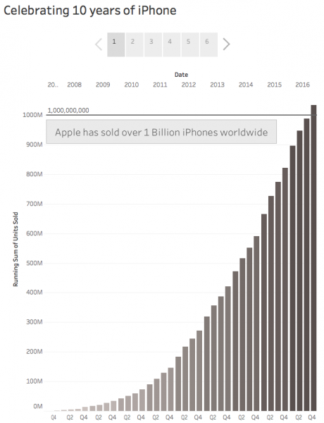
For week 2 of #makeovermonday I looked at the iPhone sales per quarter since the launch of the first iPhone. This week I decided to create a Tableau Story highlighting some of the interesting insights I found in the data. I looked at the total of units sold (over 1 Billion!), I highlighted seasonality in the data and looked at the percent change compared to the same quarter last year. You can view the interactive visualisation by clicking on the image.

#MakeOverMonday 2017 Week 2

#MakeOverMonday 2017 Week 2

Filed Under: makeovermonday, Tableau Public, Tableau Software

#MakeOverMonday Week 1 2017

2 januari 2017 by talkda-6481b375f2a76

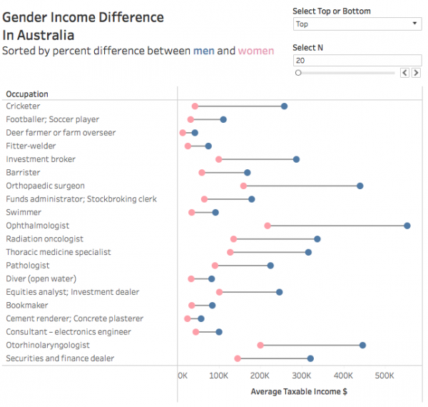
My 2017 new year resolutions include participating in Andy Kriebel and Eva Murray’s #makeovermonday every week. For week I looked at a dataset that reported on Gender Income Difference in Australia. I decided to sort the list by percent difference between men and women and give the end-user the ability to choose to have a look at the bottom or top N using a parameter. To show the gap I chose to use a barbell plot. You can view the interactive visualisation by clicking on the image.

#MakeOverMonday 2017 Week 1

#MakeOverMonday 2017 Week 1

Filed Under: makeovermonday, Tableau Public, Tableau Software

Different time series on the same axis made easier

17 oktober 2016 by talkda-6481b375f2a76

Some time ago I wrote a blogpost on how to compare different time series and plot them on the same axis. This blogpost was using a rather complex table calculation to calculate the days since start of each different time series and use that as an axis. In this blogpost I will demonstrate an easier way to achieve this, including a proper data axis. [Read more…]

Filed Under: Tableau Public, Tableau Software

Getting Dirty with Tableau – MTB Style

3 november 2014 by talkda-6481b375f2a76

Early september I visited the Tableau Conference in Seattle. A session by Jewel Loree, Andy Kriebel and Peter Gilks with the inspiring name “Porn, Pokemon and Pop Culture” really got me pumped up and ready to make my first Tableau Public viz. It took me a while to find inspiration for a good viz and after trying out various topics ranging from a story on Trappist beer to a viz on the impact of sleep deprivation (I have a six month old daughter and two your old son) I received an action camera ahead of my upcoming birthday. I had seen a post by the great Ben Jones on embedding a Youtube video within Tableau Public and I was wondering if I could take this one step further and make the video responsive to interaction with the viz. [Read more…]

Filed Under: Tableau Public, Tableau Software

Connecting Tableau to Piwik

8 oktober 2014 by talkda-6481b375f2a76

These past few months I’ve seen a rapid rise in the use of Piwik as a webanalytics solution. My clients are choosing Piwik as an alternative to paid solutions like ComScore Digital Analytix or free solutions like Google Analytics. Benefits include the data storage location, ownership of data and the ability to access non aggregate data.

Piwik stores clickstream data like visitors, visits and pageviews but is also able to store information like onsite search queries and eCommerce data. Data is stored within a MySQL database which can be hosted wherever you want giving you full control over data ownership and data storage location. I’ve seen implementations with over >100M interactions a year and I am currently working within an organization implementing a 50M interactions a year setup.

Analyzing the data gathered by Piwik can be done through their web interface which allows you to generate reports and segment the data, but as a Tableau enthusiast I was also curious if I could connect directly to the underlying MySQL database. It turns out you can! [Read more…]

Filed Under: Piwik, Tableau Software Tagged With: Extract, Left join, MySQL, Tableau Desktop, Tableau Server

Sorting percent change from Quick Table Calculation in Tableau

8 juni 2014 by talkda-6481b375f2a76

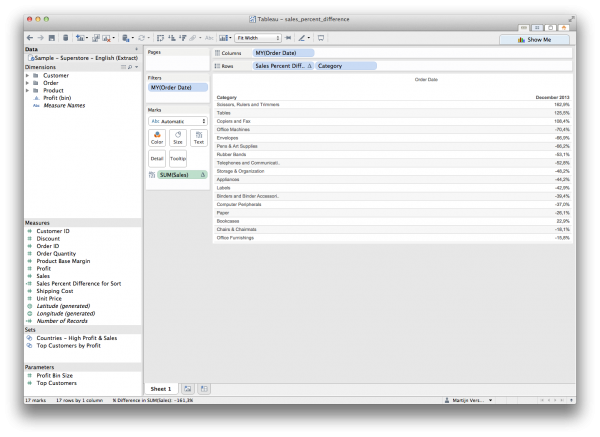
Reporting on the most visited pages within your website can be a rather static endeavor if your most popular content doesn’t change very often. Changing this report to a list of pages with the largest change (both positive and negative) in visits is most likely a lot more interesting.

Tableau Absolute Sorted

Tableau Absolute Sorted

[Read more…]

Filed Under: Tableau Software Tagged With: Calculated Field, Sorting, Table Calculations, Tableau Desktop

Plotting two different time series on the same line graph in Tableau

27 mei 2014 by talkda-6481b375f2a76

Update: I’ve written a new article that makes it easier to plot two time series in the same graph.

Tableau is a great and easy to use data visualization tool, allowing you to create beautiful and meaningful visualizations within minutes.

From time to time I run into visualizations that are harder to implement in Tableau. Comparing two time series on a day level within the same line graph is one of them. Many webanalytics solutions like Google Analytics or ComScore Digital Analytix come with these kind of visualizations build in so replicating this in Tableau is a must for me.

I’ll share the steps I’ve taken to create a similar visualization in Tableau in this blogpost.

ComScore Digital Analytix Line Graph Reference Period

ComScore Digital Analytix current period vs reference period

Google Analytics Line Graph Reference Period

Google Analytics Line Graph current period vs reference period

[Read more…]

Filed Under: Tableau Software Tagged With: Calculated Field, Parameters, Table Calculations, Tableau Desktop, Time series